I came up with the idea of “The transformation” on similar lines as those of the paintings discussed in previous blogs. I titled it so because I wanted to show light and soft forms as one views this painting from top to bottom. The increments in light and soft forms represent the gradual elimination of evil acts and the commencement of good ones. As I converted this layout from pen and ink to a final oil painting, I realized that less is more in a painting.
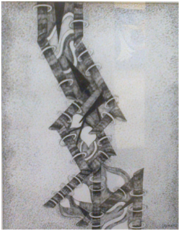
The journey of this painting was also quite long and interesting. I first made a finished pen and ink painting of this idea.
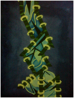
As can be seen in the above pen and ink work, I still maintained the stick and ring (representing difficulties and opportunities respectively) concept in it. After making this, I had to come up with a colour scheme. I made a layout with water colours coming up with the following scheme:
As seen in this water colour layout, I wanted to use shades of blue and mauve. I also used hints of green and white in this layout. As good enough as it seemed to be, there were some serious concerns before attempting this idea in oil painting:
- The colour scheme was using way too many colours and was in a way distracting.
- As good as the sticks and rings looked in the pen and ink version of this painting, using them in oils was not a very good idea. I had a feel that this idea needed to be simplified for its oil painting version.
- Another problem with the painting was its lack of connection with the background. It worked fine in the pen and ink version but for the oil painting, more forms were needed in the background.
- It was getting clearer to me that less is more in a painting
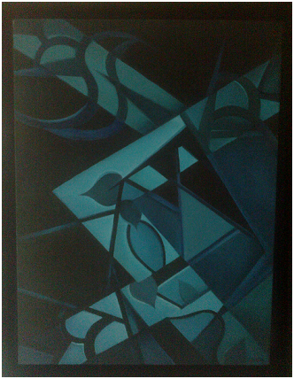
So, after all these considerations and experimenting all along, the final oil painting looked like this:
As can be seen in this painting, the background is still connected to major forms in the centre. I achieved this by extending the main forms in the background. Though the background also has some forms, they are not as highlighted as in the centre.
Continuing with “less is more in a painting”, I minimized the use of colours to shades of blue. The shades used in this painting range from the darkest shades of blue to the lightest shade.
The background in the right half is not only an extended version of the centre but also has many shades. This was a result of experimentation. When I was applying different colours on the right portion of the background, they looked vibrant and appealed to me. So, rather than keeping a dark background like left half, I preferred giving more shades to the right half of the background.
There was another interesting result of this experiment. If observed closely, one can see the side profile of a face in the right portion of the background!
That’s the fun in making a painting! You start with an idea, have a vision in mind and you can end up making something entirely different, surprising your own self. Every painting has a story related to it. Each story makes the experience and efforts of painting so much worth it.
“The Transformation” will always remain a very special painting for me as it is the first painting I ever sold!


0 Comments